ShopDreamUp AI ArtDreamUp
Deviation Actions


Suggested Deviants


Suggested Collections


Comments40
Join the community to add your comment. Already a deviant? Log In
Very nice! I love the clean, minimalistic feel to it. The gray gradient works very well, and for the most part, it's pretty straightforward.
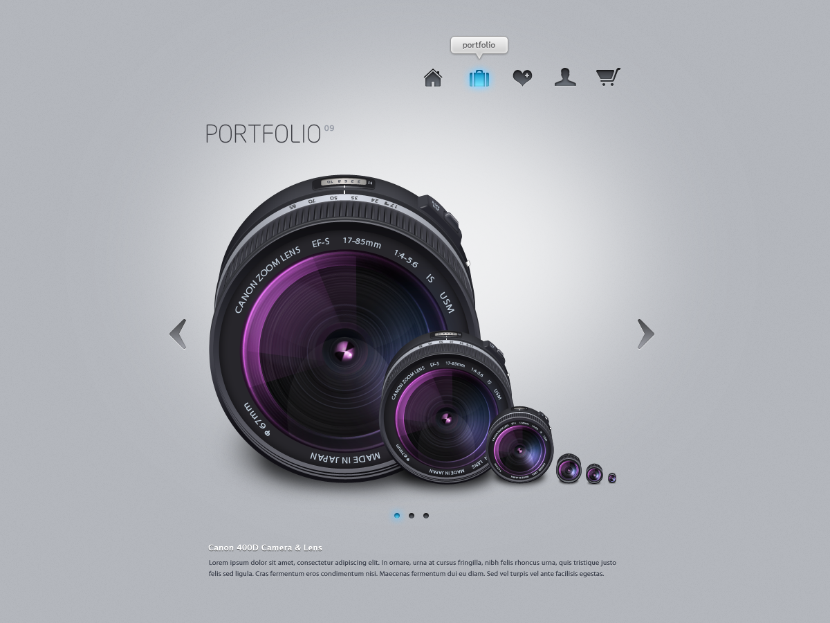
That being said, I have some concerns about the functionality of the site. First, I love the camera lens image. But is that a sample portfolio piece? So much of this portfolio relies on the impact of each image, and I'm not sure how a non-transparent square piece would look compared to the one shown here. (Did that make sense? I'm basically talking about the continuity.)
I agree with the other critique that mentioned the ambiguity of the heart and the person icon. While a text-on-mouseover feature would work, it still left me a bit confused. (On second thought, the person is probably a bio page?)
I also believe that the typography could use some work. The text at the bottom is very hard to read if you don't have perfect vision, and legibility is key. (It looks nice graphically, but it's just not too functional/noticeable.) Also, the text that says PORTFOLIO feels a bit bland to me. Yes, it's your portfolio, but what about branding? Whose portfolio am I looking at? If I'm examining the work of lots of artists, I want to be able to remember yours--and a simple logo or a name can go a long way.
Despite those crits, though, I really like the design. It makes a bold statement and looks very confident. Definitely one for my favorites folder!